Introduction
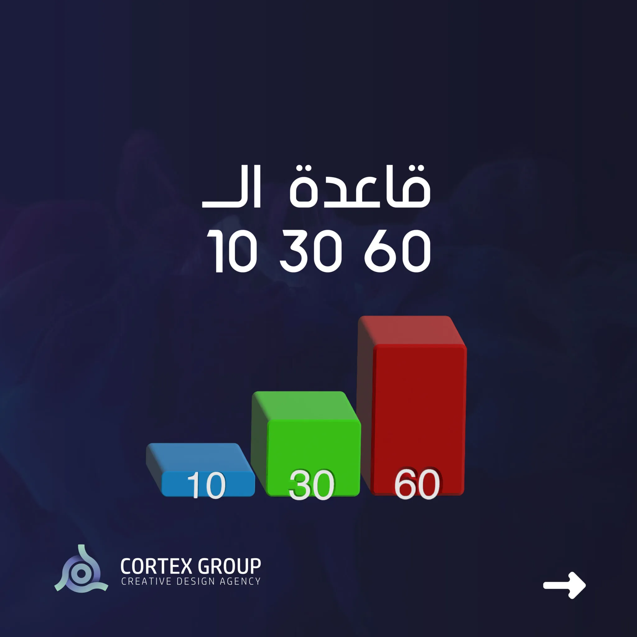
The 10/30/60 rule is a classic décor design principle that aims to achieve aesthetic balance and attractiveness in home décor. This principle is used to determine the distribution of colors in the room by a specific percentage, where half of the dominant colors are the most used colors that should be intensively present in the space. Next to it, there is a smaller secondary color but is important to enhance the contrast and aesthetic diversity of the design. Finally, it is a pleasant subtle color ratio that adds a touch of soft and relaxing colors to the overall environment.
60% of the room should be predominant, 30% secondary and the last 10% should be light.
— Sarah Lynn Brennan, Interior Designer
Rule Detail
In this context, the 10/30/60 rule can be elaborated as follows:
Predominant color (60%): It represents 60% of the dominant color that covers the large area of the room. This color is the most commonly used color and is considered the main color in the design. It is preferable to use neutral colors such as white, beige, gray or calm natural colors to meet this ratio.
Secondary color (30%): It constitutes 30% of the secondary color that is added to achieve contrast and diversity in the décor. This color can be of a different shade from the dominant color and can be a complementary color to it. It is preferable to use the secondary color in the furniture of a piece or prominent detail in the room.
Light pleasant color (10%): The pleasant light color makes up 10% of the design and is used to add a touch of soft and warm colors. This color can be used in accessories, pillows, curtains, or any other small décor details.
For more simplification
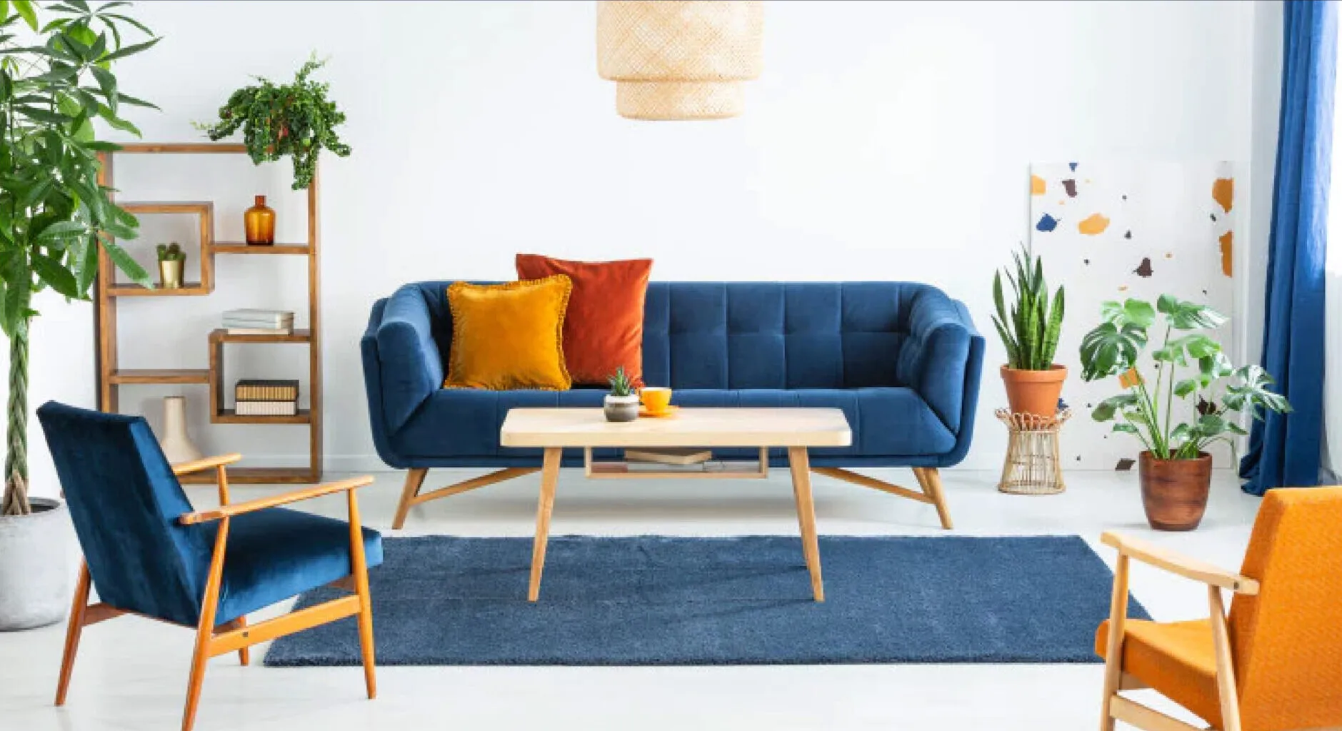
- 60% is the color of the wall (background)
- 30% is furniture
- 10% is artwork and accessories
Applying the rule to web design
The same rule can be applied to web design, check it out:
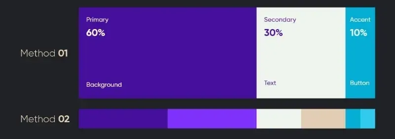
- 60: background
- 30: titles, paragraphs, images
- 10: buttons, links

Conclusion
This rule allows designers and homeowners to organize the use of colors in a balanced and coordinated manner, which contributes to creating a comfortable and attractive atmosphere in the space. The 10/30/60 rule is a flexible rule and applies to various decorative styles, and can be applied throughout the home including living rooms, bedrooms, kitchens, bathrooms, etc.